Child to Parent Communication by simple action
To communicate between Child to Parent component we should first understand the Events.
Lightning web components dispatch standard DOM events. Components can also create and dispatch custom events.
What is an Event?
JavaScript's interaction with HTML is handled through events that occur when the user or the browser manipulates a page When the page loads, it is called an event.
- When the user clicks a button, that clicks to is an event.
- Other examples include events like pressing any key, focus, blur, closing a window, resizing a window, etc.
- Developers can use these events to execute JavaScript coded responses, which cause buttons to close windows, messages to be displayed to users, data to be validated, and virtually any other type of response imaginable.
Phases of an Event
The standard DOM Events describes 3 phases of event propagation:
- Capturing phase –In this event goes down to the element.
- Target phase –In this event reached the target element.
- Bubbling phase – In this event bubbles up from the element.
Note - Capturing phase is rarely used in real code, but sometimes can be useful. Normally it is invisible to us. The Lightning web component has only two event propagation
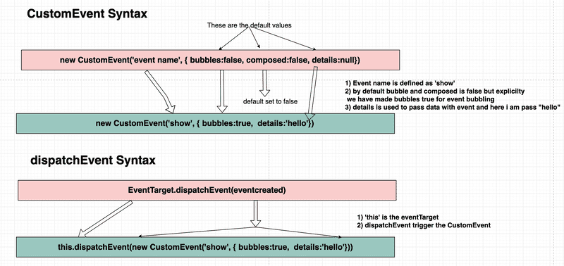
bubbles - A Boolean value indicating whether the event bubbles up through the DOM or not. Defaults to false.
composed - A Boolean value indicating whether the event can pass through the shadow boundary. Defaults to false.
Create and Dispatch Events
To create an event, use the CustomEvent() constructor.
- The
CustomEvent()constructor has one required parameter, which is a string indicating the event type. - You can use any string as your event type But recommend are
- No uppercase letters
- No spaces
- Use underscores to separate words
- Don’t prefix your event name with the string on, because inline event handler names must start with the string on
- To dispatch an event, call the
EventTarget.dispatchEvent()method. - In LWC
EventTargetisthis

Child to Parent communication
There are Three kind of child to parent communication
- Simple Event
- Event With Data
- Event Bubbling
Complete demo of the components.
After placing the component on the page, you will see the following output.

In this blog will only talk about Simple Event
- Create two LWC components
modalParentComponentandmodalChildComponent. - Add the code to the corresponding file from the code given below.
modalParentComponent
import { LightningElement } from 'lwc';

export default class ModalParentComponent extends LightningElement {
    showModal = false
    showHandler() {
        this.showModal = true
    }
    modalCloseHandler(){
        this.showModal = false
    }
}<template>
<lightning-card title="Simple Event" icon-name="custom:custom14">
<div class="slds-var-m-around_medium">
<button class="slds-button slds-button_success" onclick={showHandler}>Open Modal</button>
<template if:true={showModal}>
<c-modal-child-component
header-text="Message!!"
body-text="This Modal is a Child Component. Triggered from parent and on click of close button it will dispatch an event to parent handler"
onclose={modalCloseHandler}
></c-modal-child-component>
</template>
</div>
</lightning-card>
</template><?xml version="1.0" encoding="UTF-8"?>
<LightningComponentBundle xmlns="http://soap.sforce.com/2006/04/metadata">
<apiVersion>48.0</apiVersion>
<isExposed>true</isExposed>
<targets>
<target>lightning__AppPage</target>
<target>lightning__RecordPage</target>
<target>lightning__HomePage</target>
</targets>
</LightningComponentBundle>- In the parent component,
modalParentComponent.htmlwe have created alightning-cardto give our component better looks and feel - Withing the
lightning-cardwe have created abuttonwith an event attributeonclickthat will trigger theshowHandlerhandler on click of the button - Below button we are calling the child component using
c-modal-child-component. - In
modalParentComponent .jsfile, we have created ashowHandlerhandler in which we are changing theshowModalproperty value fromfalsetotrue. - By default
c-modal-child-componentcomponent is hidden becauseshowModalproperty isfalse - On click of button
showModalproperty becometrueandc-modal-child-componentcomponent become visible
modalChildComponent
import { LightningElement, api } from 'lwc';

export default class ModalChildComponent extends LightningElement {
    @api headerText
    @api bodyText
    closeHandler(){
        this.dispatchEvent(new CustomEvent('close'))
    }
}<template>
<div id="myModal" class="modal">
<div class="modal-content">
<header>
<strong>{headerText}</strong>
</header>
<p>{bodyText}</p>
<footer class="text-right">
<button class="btn danger" onclick={closeHandler}>Close</button>
</footer>
</div>
</div>
</template>/* The Modal (background) */
.modal {
display: block;
position: fixed; /* Stay in place */
z-index: 1; /* Sit on top */
padding-top: 100px; /* Location of the box */
left: 0;
top: 0;
width: 100%; /* Full width */
height: 100%; /* Full height */
overflow: auto; /* Enable scroll if needed */
background-color: rgb(0, 0, 0); /* Fallback color */
background-color: rgba(0, 0, 0, 0.4); /* Black w/ opacity */
}
/* Modal Content */
.modal-content {
background-color: #fefefe;
margin: auto;
padding: 20px;
border: 1px solid #888;
width: 80%;
width: 80%;
top: 50%;
position: absolute;
left: 50%;
transform: translate(-50%, -50%);
}
.btn {
border: none;
color: white;
padding: 14px 28px;
font-size: 16px;
cursor: pointer;
}
.danger {
background-color: #f44336;
}
.success{
background-color: green;
}
.danger:hover {
background: #da190b;
}
.text-right {
text-align: right;
}<?xml version="1.0" encoding="UTF-8"?>
<LightningComponentBundle xmlns="http://soap.sforce.com/2006/04/metadata">
<apiVersion>48.0</apiVersion>
<isExposed>false</isExposed>
</LightningComponentBundle>- In
modalChildComponentwe have created two public propertyheaderTextandbodyText. Property become public if we decorate it with@api. - In
modalChildComponent.htmlWe have close button and on click of close button we are callingcloseHandlermethod. - In
closeHandlermethod we are creating the new custom eventcloseand dispatching it .
this.dispatchEvent(new CustomEvent('close'))- Once
closeevent get's triggered it gonna catch my the methodmodalCloseHandlerwhich is map to thec-modal-child-componentcomponentoncloseattribute. - Once
modalCloseHandlerget called it makes theshowModalproperty false and hide thec-modal-child-componentcomponent
Output
After placing the component on the page, you will see the following output.
